


NerveUs
Online Peripheral Nerve Injury Patient Resource
This project in short…
To address the lack of patient resources in the peripheral nerve injury field, I developed an online educational resource that equips patients with information about peripheral nerve injury prior to their clinical appointments.
The resource features illustrations, interactive elements, and content in plain language to help patients and their families better visualize and understand their injury. This tool is intended to facilitate patient care-provider conversations and serve as a comprehensive resource that patients can revisit at any point in their PNI journey.
Check out the prototype here!
Jump to a specific section:
Roles
Illustration, UI/UX Design, Front-End Development, 2D Animation, Content Writing
Format/Platform
Web (optimized for desktop and mobile)
Tools
Adobe Illustrator, Adobe Photoshop, Procreate, Adobe After Effects Autodesk Maya, VS Code, Vercel.
Client
Dr. K Ming Chan @ University of Alberta, Division of Physical Medicine and Rehabilitation
Audience
Peripheral nerve injury patients, family and friends.
Timeline
April 2024 - August 2025
The challenge
Peripheral nerve injury (PNI) is a lesser known yet common neuropathy involving trauma to the peripheral nervous system. Most PNIs result from unexpected accidents and treatment is filled with uncertainty given variation in injury, treatment options, and recovery timeline. As a result, patients often feel overwhelmed and unsure of what to expect, especially in a clinical setting.
While there is a major need for patient education, there is a significant lack of educational resources in peripheral nerve injury that are accessible and informative to patients.
The research
During the research stage, I performed a literature review, media audit, and conducted patient interviews to get a better understanding of the current landscape of PNI resources.
-
Patients expressed the need for more informational and emotional support for PNI and the associated symptoms, treatment options, and timeline of recovery.
Interviewed PNI patients highlighted feelings of uncertainty and feeling left out of the decision making process due to their gaps in knowledge.
-
PNI resources that were engaging, were not suitable for patient education:
Several of the more interactive resources were designed for student education, and did not meet the informational needs of a patient audience. They went too far in depth, or discussed irrelevant topics.
The most accessible websites were not accommodating to different user experiences.
Many of the most accessed websites were written at an average of a grade 9 reading level, while a 6th grade reading level is recommended to be accessible to most patients. Resources that were at a grade 6 reading level were still text heavy and lacked engaging visuals.
-
4 PNI patients were interviewed about their experiences navigating peripheral nerve injury treatment. A card sorting exercise revealed common themes that patients were interested in understanding more about:
What peripheral nerve injury was
Who they would be seeing at the clinic
What they would be doing at the clinic
What the treatment options and outcomes would be like
Common emotional sentiments were that they::
Felt satisfied with their care at the clinic
Felt unprepared to ask questions
Didn't feel control over their healthcare
Gave up or did not attempt looking online and let appointments tell them what was happening
The solution
Develop an interactive educational web resource that can be used by patients experiencing peripheral nerve injury throughout all stages of treatment.
This resource is aimed to help patients and their families understand more about the peripheral nerve injury, from the affected anatomy prior to injury, all the way to recovery stages.
The project objectives were to:
Address the most urgent questions and concerns indicated by patients.
Enhance the quality of resources received by PNI patients.
Provides an engaging way for patients to learn about PNI.
Empower patients to make healthcare decisions and communicate effectively.
The design process
Empathy maps, user personas, and context scenarios.
These were created based on the research stage of the project to get a better understanding of how users might interact with the resource.

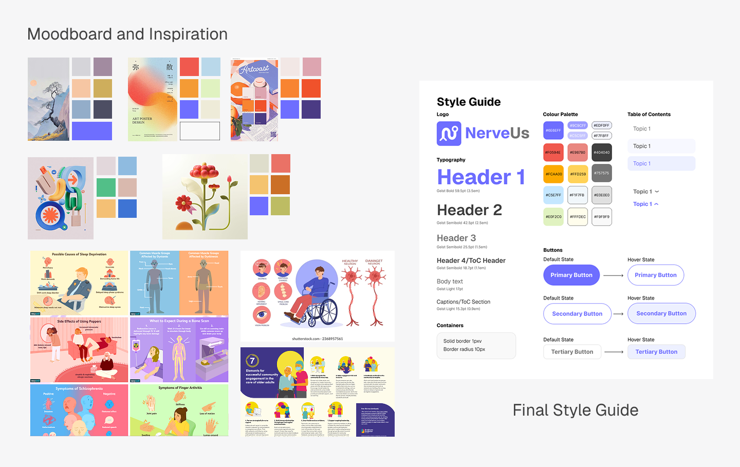
Visual styling.
Moodboards were assembled to get an idea of visual styling. I chose purple as my primary colour to contrast against the warm yellows, reds, and oranges I knew I would be using a lot for illustrations of nerve and muscle.
I looked for inspiration of styles that featured little to no line art so that a) 2D animations could be created much faster, and b) the static illustrations made in the same style would look cohesive.
I chose to use Geist, a modern, easily legible, sans serif typeface for the main text and logo.
Wireframe & Prototyping.
I created sitemaps and wireframes to construct an information hierarchy and map out where all the content would fit in. This also helped me figure out user flows and identify potential usability issues before beginning to code.
After I was satisfied with the wireframe, I created a low fidelity working prototype to test out interactions and further troubleshoot.

Visual Asset Creation.
For this project, I mainly used Procreate, Adobe Illustrator, and Adobe After Effects to create my static and animated visual assets. The workflow for static images involved creating sketches, soliciting feedback from my content advisor, then integrating them into a refined sketch for one final check before creating a finalized render.
Creating animations involved a similar workflow for feedback, with the added steps of creating storyboards, animations, and integrating them into the code.

Coding & Interactivity.
Normally at this stage, the design documents would be passed off to the development team. However, since this was a self-led project, I was responsible for the final functional website. I used HTML, CSS, and Javascript for the main code. Gemini AI was used to help integrate more complicated interactive features.
The highlights
UI/UX.
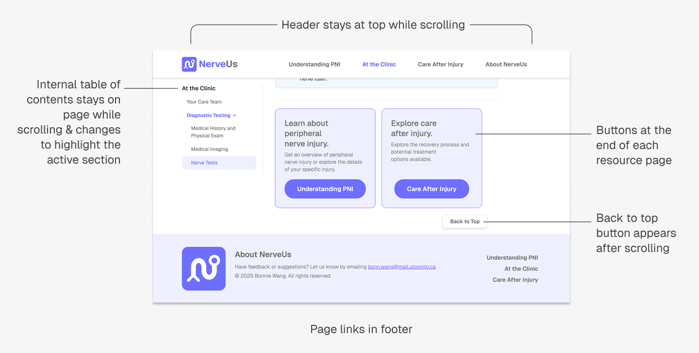
According to Miller’s monitoring and blunting hypothesis, people respond to stressful situations such as illness/injury by exhibiting different health-seeking behaviours. With this in mind, I designed NerveUs to be suitable for multi-level information seeking behaviour. The site has multiple layers of organization so that individuals who have different levels of interest can access the information they want easily.
Inter-page navigation:
Navigating to different pages can be accessed from the navigation bar, footer, or buttons at the bottom of the page
The navigation bar stays at the top while scrolling so it is always visible
Intra-page navigation:
An internal left-rail table of contents allows users to jump to different sections of a page easily.
The back to top button provides an additional option for navigation.
Interactivity.
Different types of media were used to convey different types of information.
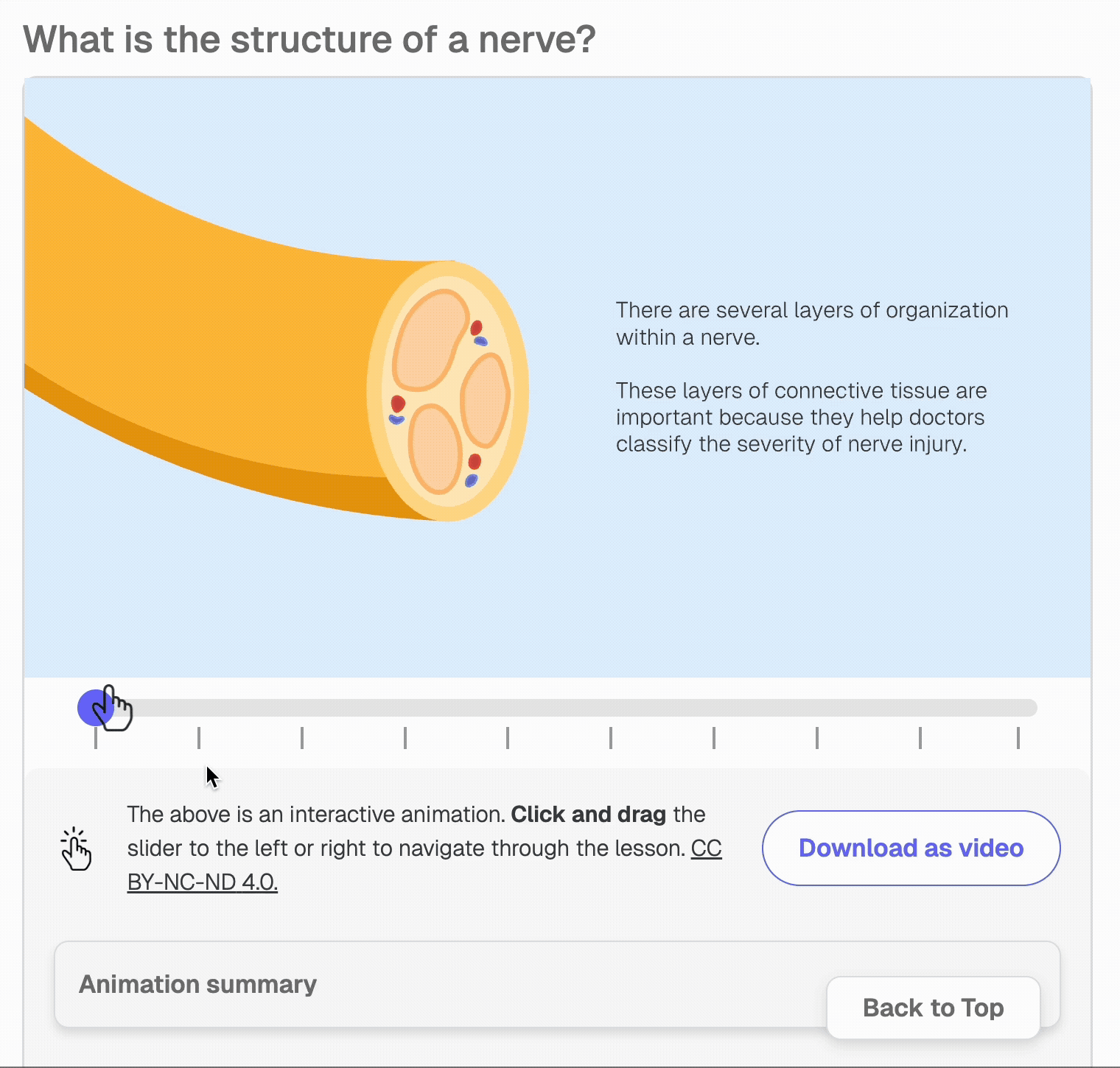


Interactive Sliders
Reduces the visual clutter of the web page.
Presents complicated information in a more engaging way, inviting interest to those topics.
Allows users to control the speed and pacing of their learning allows for greater patient engagement.
Breaks down and chunks information into sections.
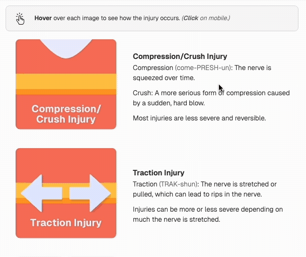
Hoverable Animations
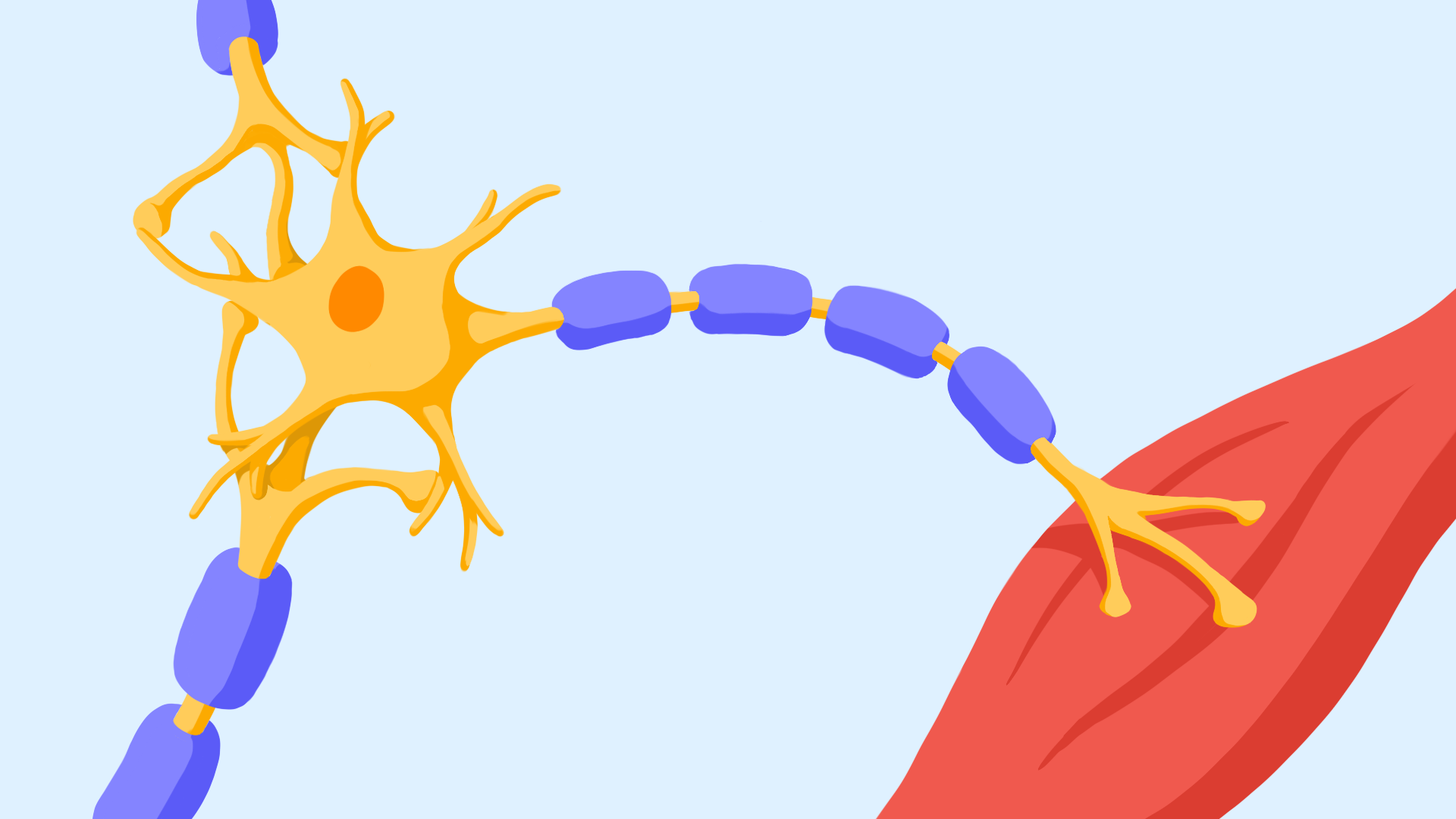
Conveys procedural information (ex. nerve surgeries) and chronological actions (ex. what happens when a nerve is injured).
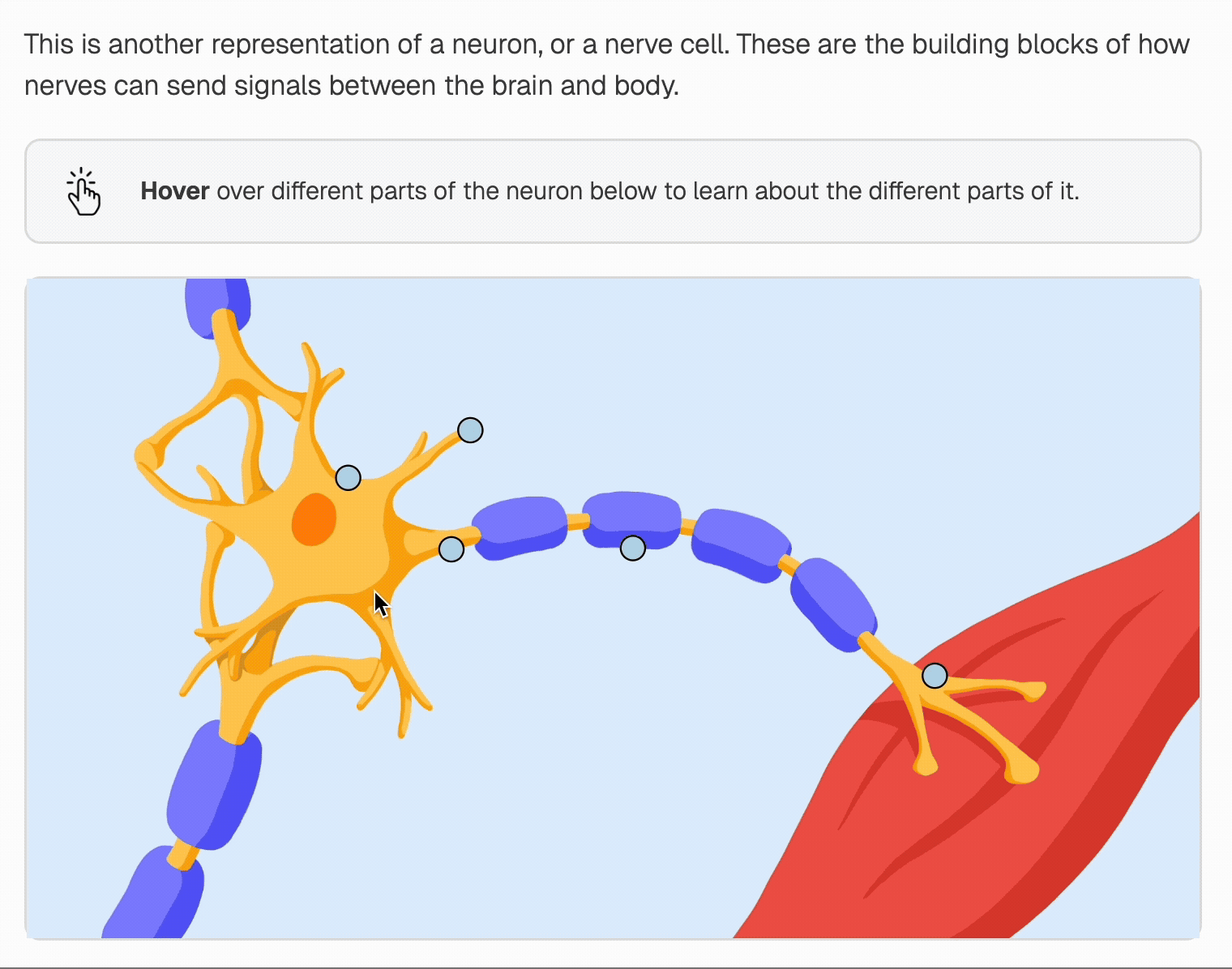
Interactive Hotspots
Makes interacting with information more engaging.
Targets specific areas of a diagram.
Helps hide optional information that people may not be interested in accessing.
Static Images
Can show snapshots of what to expect at the clinic (ex. when you see someone on your care team, or when you get diagnostic testing done).
In these contexts, the patient doesn’t need to know exactly what is happening and doesn’t necessitate an animation or interactive. We also might not know because each patient’s experience will be different, and portraying these with certainty could be misleading.
Accessibility.
All images have alt text descriptions in the code for screen readers.
More complicated media such as the interactive sliders are available in alternative formats (transcript, video with narration).
Callout boxes throughout the resource call attention to information summaries, empathetic messages, and tutorial boxes to highlight the most important information in each section and page.
The text is at a grade 6-7 reading level according to the Fleisch-Kincaid Grade Level Test. Pronunciation guides have also been added for more complicated terms.
The takeaways
Content scripting and UI/UX design are a large part of designing the resource experience.
This definitely took a longer time than anticipated and I know to allocate more time for this earlier on for future projects. What is in writing does not always transfer over to visuals—so planning for edits, multiple iterations, and pivots are essential.
Patient communication exercises ability to restrict and consolidate scientific information into what is most important for users.
As biomedical visualizers we understand the science and understand how to make fun, beautiful designs—but this can’t get in the way of clarity and what the user needs. In terms of both visual design and content, I found that it was important to check if what you are creating is actually valuable for the user, or if it is merely there for decorative purposes.
Tech experiments and low fidelity prototypes forces you to test your ideas.
Make space for tech experiments and low fidelity prototypes. This removes the comfort of having an idea/plan and forces you to put it to action. It also challenges the assumptions made in your brainstorming sessions. You’ll quickly find out what does/doesn’t work conceptually and any limitations in technology.
The future
Adding ARIA labels to code to make accessible for assistive technologies.
To make the resource even more accessible to individuals who require assistive technologies like screen readers, I plan on revisiting the code to add ARIA labels, which provide more descriptive textual context to elements on the screen.
Launch & Testing.
After releasing the NerveUs to the public, we are hoping to solicit patient feedback. Based on the feedback we receive, the resource will be adjusted to make sure patient pain points are addressed.
Growth & Expansion.
This is only the beginning! We are hoping to expand the resource to include more specific information for other types of peripheral nerve injuries, as well as spinal cord injuries.